
Hi Everyone,
At 1:00 pm we gather again at the Cascades Restaurant in the National Gallery to eat and chat.
IC is a non-profit, all-volunteer trade association dedicated to promoting the art and business of illustration since 1986. Our membership network includes professional illustrators, graphic designers, educators, students, vendors and related businesses.





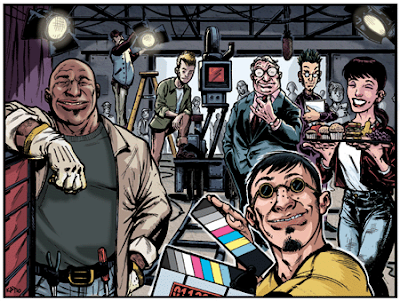
My style is mostly humorous; pretty traditional approach done digitally
I use a mix of media usually -- I start with a pencil or ink drawing, then scan and color digitally.
My workspace is on the top floor of my house and doubles as a geek room. I like to keep a lot of influences around where I can see them.
I'm not a morning person, so I'll usually start the day by catching up on e-mails and drinking enough coffee to jolt my system awake. If I have a drawing on the board, I'll often do the most technical aspects of the drawing (things like filling in large areas of color, lining out grids, stuff that doesn't take much creativity) until I wake up sometime around 3 o'clock and feel awake enough to work on the more artistic aspects of a piece. I usually will work off and on until about midnight.
The first artist whose name I became aware of was comic great Jack Kirby. His work was so dynamic and fluid, I just had to know who this guy was.
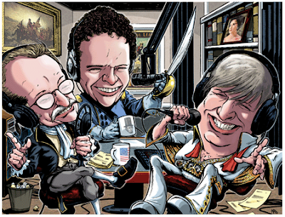
I don't know that I have a favorite category of illustration. I have a short attention span, so I tend to jump between editorial illustration, children's books and comics.
I'm trying to get more into comics and children's books. I really enjoy the respective story-telling aspects of both.
I have my website and send out cards occasionally. I will also send an e-mail to a magazine's art director if they accept them. I also get a fair amount of word of mouth work from a variety of different sources.
My advice to anyone thinking about becoming an illustrator is to really look at the big picture. Everything you do in your life--who you're with, how you handle your money, how many kids you have, etc.-- affects your ability to create illustrations and make a living. It doesn't usually pay as much as it's worth and there's no long-term security in many, if not most, cases. You really have to love it to put up with the level of abuse that often comes with the territory. But when it's working, it can be very satisfying. Last thing I'd say is get out and smell the fresh air on a regular basis. Illustrators are often solitary creatures, and it just ain't healthy to spend that much time alone staring at white sheets of paper.
Be sure to check Kerry's portfolio at the IC of DC website.

I try to find a balance between simplicity (flat/graphic) and dynamic, colorful compositions.
Mixed - Pencil, Ink and Digital
Currently, way too small. It's a corner of my bedroom so it's a little crammed but comfortable. Primarily a drafting table I've laid out flat to set up my computer (a Mac Book Pro, 21" Dell Monitor and Wacom Tab). Somehow I've also managed to fit a couple storage boxes of assorted paints and pastels on the drafting table. This is all flanked by a coffee table turned shelving unit where I hold the rest of my art supplies, scanner and printer. Another drafting table is in storage until I can move into a larger space.
I begin everything with sketches to plan out the composition. I deliberately push myself to try differing angles, compositions and subject matter until I've come across something I think will work. I then scan the sketch into Photoshop and enlarge it to the size specified or maybe a little larger. I fill in the image with Cyan set at 20% and Fade using the Screen option. This gives me a nice light (and I do mean light) blue. This is printed out onto HP 32lb LaserJet paper using my InkJet printer (InkJet on LaserJet paper works since I use the printout for pencilling and nothing else).
Side note: I like this paper because of its slick surface; it handles pencil and ink splendidly.
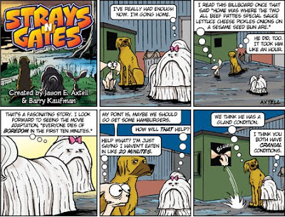
This gives me a blueline version of the rough sketch. On this I go back in with a blue pencil (Prismacolor or Col-Erase) and refine much of the original sketch until forms, perspective and any other details seem right. I then go over that with either pencil (as I do for my comic strip, Strays 'N Gates) or with ink (Town of Hardeeville). I then scan the full pencilled or inked drawing into Photoshop where I use various tools to refine the black line work until it's crisp and clean.
I apply color with my Wacom Tab on a separate layer set to multiply. Sometimes, additional effects require extra layers (the lighthouse glares in Town of Hardeeville). I always make a finalized (and flattened) TIF file and a smaller web version.
Rockwell provided some of the earliest memories of inspiration but another that I believe has had just as much of a profound effect is Philip Travers' cover art for the Moody Blues album, In Search of the Lost Chord. I've always found it hypnotic and majestic, composed to represent and simultaneously transcend space and time.

I'd have to go with Fantasy/Comic Art on this one but that's really generalizing it since even within each of those is a wide variety of styles and technique. I've always enjoyed work that pertains to fictionalized worlds and characters. The amount of research necessary to produce some of the most profound Fantasy/Comic Art goes hand in hand with imagination, not an easy feat, but one that comes with years of experience, open-mindedness and experimentation.
Certainly more digital, but that's being vague. My goals pertain more to subject matter than style. But I would like to refine (ie. simplify) my work to a graphic style that tells a story at it's most vivid. Telling stories through (or with) my art has always been the aim, no matter what style I choose to communicate it with.
I have my own web site, which is in dire need of an update and a re-design, but it doesn't attract as much traffic as I would like. I try to push myself into social networking sites (Facebook, Blog's, etc.) which help, if but a little. I also have some backing from previous employers who have helped get me the contacts necessary to promote some of my work. Craig's List has helped in the past. I'm hoping the IC will do the same (only recently joined). Having an actual physical book to show around at conventions has always been the biggest and best publicity in my opinion.
Don't give up. Be persistent. Keep drawing. Don't procrastinate.
Be sure to check Jason's portfolio at the IC of DC website.

"Being self-employed, the Hodge family has short term medical insurance that will not fully cover all of their bills. Additionally, with the care they are giving Matt, full-time work is not possible for Tim right now. This loving family is relying on their faith and the love of family and friends for their survival. This is a tragic accident that will forever affect their lives as the road to recovery for Matt may be a long one.
In an effort to help the Hodge family, the National Cartoonists Society Foundation is getting involved by hosting a fund-raising auction to be held on eBay. The NCSF is a fully licensed 501(c)(3) non-profit organization that not only helps fund educational endeavors for cartooning, but is there to help cartoonists in dire circumstances like the Hodges."

A mixture of found imagery, photos, traditional/hand-drawn elements, and whatever might be in the bottom drawer (if it works!)
Digital/Collage
I'm tucked nicely into the corner of the shop of Fan Works Design. Right next to my stacks of books of reference to inspiration is usually a tumbling stack of CDs, and now a turntable. And a very ancient dog, Cracker, who acts as shadow and unconditional and unwilling audience.
Perfect.
I share the studio with my partner Dawn Ripple McFadin who provides not only guidance, a boot when I need it, but also is an invaluable sounding board. We're located in the Fan in Richmond so if it gets too frenetic in the shop, we can easily take a stroll and escape to a myriad of distractions to clean the engines.
I always start with the tried and true thumbnail sketch. One of my illustration teachers back in the day always stressed the importance of those thumbnail sketches. He was fond of doing tiny, tiny thumbnails: "That way your problem is only a few inches big." I then start amassing as much material as I can, be it photos, take photos, hand-drawn elements, textures, object/images to scan, etc … More often than not I throw in much more than I initially intended or will need, so much of the process is actually editing. I start paring things down to what is needed and what works, always very mindful of the happy accidents that happen along the way.
Brad Holland. I was always drawn to heavily editorial work and his work fit the bill perfectly, albeit with an edge and strangeness that I found compelling. At the time I was focusing on painting and his technique and style hit me right between the eyes.

I'm still drawn to editorial work. I'm sure much of that is a hold over from working as a newspaper staff illustrator/designer back in the day. But even as my own work got more open to interpretation and "textural" to a certain degree, content was always there, not far behind.
Funny you should ask: more editorial. Much of the illustration work that I do for Fan Works Design has to cover a broad range of treatments for a variety of clients, but when it's a focused effort on illustration as the final product it's coming full circle back to leaning heavily on the editorial side of things. I recently finished two pieces for the Wall Street Journal which brought me full circle back into the arms of newspapers.
note: one image attached is from the Journal pieces
I'm listed with the IC, keep abreast of the doings of the Richmond Illustrators Club, theispot, IllustrationMundo, exploring some advertising options since that is always in flux, I have a site that focuses on my illustration work only (with the requisite blog), Facebook for myself and Fan Works, occasional tweets into the ether, email announcements/news to existing and potential clients and am looking into getting back into good old fashioned USPS mailings. And tried and true word of mouth …letting people know what I do and what I can do.
Develop your aesthetic. And I don't mean strictly your work: everyone has their own aesthetic, who they are drawn to, what they are drawn to, etc … be it their illustration work, what they read, what they watch, the music they get into …polish it up, keep it living. It's yours and if you work at getting it up to speed it starts taking care of itself {and at times thinking for itself} and feeding right back into itself, and you.
Be sure to check Kevin's portfolio at the IC of DC website.

I like to sit with my painting about 4 inches from my face, so my work is generally very detailed. I use lots of tiny lines and dots to communicate something larger, and counteract that with organic shapes and splatters. I think this style creates artwork visually appropriate for a variety of ages – from child to adult – but I like to carry in themes that cater to a mature audience. I find these balances – tight and detailed vs. organic, light-hearted visual vs. heavier message – to be the main elements at the base of an interesting illustration.
I love acrylic paint, watered down to something similar to watercolors. I'll layer that with ink and even a little color pencil to hit some brightly colored pops.
Because my paint is applied in a series of very watery washes, I have worked in what basically amounts to a little ball on the floor for years. Within the past month I moved a drafting table into my studio – I'm pretty sure it's about time I graduated from the floor.
I begin by filling my sketchbook with lists and little sketches. After client approval, I create the final illustration by layering pencil, ink, a watered-down acrylic concoction, more ink, and then colored pencil. I'll scan that in and use a bit of Photoshop for color correction. Repeat.
I was immediately inspired the first time I saw the work of Lisbeth Zwerger. Her illustrations are playful enough for fairy tales, but with undertones that are ominous enough to intrigue the viewer. To me, it captured the essence of illustration and its purpose as a narrative art form that can't be achieved any other way. I see the tension between these beautiful images that she creates and the darker subject matter within them as the inspiration for what I'm striving towards.
I respond to children's book imagery that is smart and treats its audience accordingly. There is work out there that achieves this by stepping outside of what one expects for the younger viewer, and that is what excites me and what I work towards myself.

Over the past two years, I have found myself focusing on illustrations for a line of greeting cards I created called Holly Camp Cards. Most of the cards are animal based, and it really appeals to me that, under the guise of brightening peoples' day, I can design little sad-faced creatures. I definitely enjoy the unexpectedness of greeting cards that aren't always brimming with the typical sunny sentiment.
What do you do to promote your work? To promote my editorial work, I have sent out postcards with my images to art directors, visited their offices for face-to-face interviews, and other forms of various harassment. For my greeting card line, the independent craft shows I participate in provide the opportunity to chat with customers about my work and place a tangible product in their hands. I also created a Faceboook page for the cards, which has been a very successful tool for increasing exposure.
Work hard and don't sleep. Be persistent. Look at everything.
Be sure to check Holly's portfolio at the IC of DC website.


I enjoy working in a variety of media and in different styles, so it's difficult to describe my specific style. Scratchboard, pen and ink, woodcut, graphic, airbrush, oil painting, pastel, collage are some of the various media I use that will eventually end up as my digital illustration. My work ranges from corporate/conservative to whimsical/comical, and anything in between. To help a client choose an appropriate style for their project, my website has a search by style or subject.
Whatever I'm working on at the moment.
It's small, but efficient. I've crammed every square inch of my 10x15 studio with computer equipment, tv, stereo, large drawing table, big metal flat file, and bookshelf, along with the washing machine and dryer. Taped up like wallpaper are print outs of recent work, that hang on my roof line slanted ceiling until they either get bleached out or fall off. My floor often is the repository of finished jobs that need to be put away or current assignments that have no place besides a meager taboret. Spread throughout the house are my reference books and picture files. The trade off for lack of space at home is being able to step outside and enjoy a run with our dog in the rural countryside.
I may be found working part of the day sketching on paper, doing an intricate scratch board illustration, working with bold vector graphics in Adobe Illustrator,airbrushing in Photoshop, or painting a pastel in Corel Painter. Working in different techniques keeps me fresh, and excited about my work. I've found it an advantage to be able to work in the technique that best fits the project.
I fell in love with the Golden Era of Illustration, so I'd say N.C. Wyeth.

I continue to try on current trends and styles to challenge myself and expand my repertoire, but when called upon to work in one of my traditional techniques, I challenge myself to better myself or add a new twist. So, I never am feeling bored or stagnant. I see myself as a work in progress that will never cease.
What do you do to promote your work? I advertise in the Directory of Illustration, http://www.folioplanet.com/ , http://hireanillustrator.com/ , and http://www.contactacreative.com/ . I'm also represented by American Artists, and Stockart.com . Membership in the Illustrators Club of Washington DC, Maryland and Virginia has been a valuable promotional and networking tool for me.
Get as much practical experience in the field with a full time position to start out, and set a goal to eventually be a self-sufficient freelancer. I'd recommend taking courses in art school to include graphic design, web design, animation, and 3d to broaden your skills.
Be sure to check Jim's portfolio at the IC of DC website.
Kevin McFadin recently finished up these pieces recently for the Wall Street Journal
{article here} to accompany an article on the ever-fashionable realm of conspiracy theories.
"Back in the day I had a run at newspapers in California, Maine and Pennsylvania as an illustrator/page designer, so it was a definite blast from the past," Kevin says. "It was a great experience to revisit that world after a substantial hiatus and to collaborate on a project so heavily editorial. I was really pleased with how the finals came together and the amount of freedom the Wall Street Journal gave me to reach the solutions. But more importantly, the Journal was very happy with the outcomes. All way around, an immensely satisfying assignment. I hope I get the opportunity to fire up the pistons on more exchanges like this one."

My style combines swirly bold line with subtle color. I love drawing people, gardens and maps. I also enjoy creating lettering.
Digital/collage
My studio feels like a tree house and is filled with a variety of fun art supplies, sea shells, rocks, awe inspiring kid’s art, pine cones, buttons, and other unusual found objects and silly ephemera from my youth. The studio itself is very small, so small that a realtor couldn't legally list it as a bedroom, but it opens out onto a second floor screened in porch that is perfect for drawing, painting or anything that necessitates ventilation. I am, therefore, acutely aware of the weather. Inside I have a 1940s architect's oak drafting table that I bought for $25 dollars in Texas. It pretty much takes up the whole room.
I love research!! That's where I start. I sketch in my sketchbook for rough ideas/concepts. I try to always sketch from life. Sometimes, especially if I am drawing plants or people, I will also bring my camera and photograph my subjects from various angles. After I've narrowed down to a few concepts I move to tracing paper to clarify ideas and refine/stylize drawings for presentation. After client approval of sketches I scan them and create lines in Illustrator. I use a Wacom tablet for pressure sensitivity. Then I find and/or create textures, I've got drawers of painted squares, papers and fabric. Finally, I scan the textures and composite them with the line in Photoshop.
Ludwig Bemelmans. I adored his Madeline books when I was little. Those twelve little girls in two straight lines were just so darn cute! After reading the first one I could never again see a crack in a ceiling or sidewalk and not imagine it to be something magical.
I also had/have a thing for cookbook illustrations from the 40s and 50s. One of my prized possessions is Betty Crocker's Dinner for Two illustrated by Charley Harper.

I've been adding more texture to my work by scanning fabrics, plants and painted surfaces. I've also recently been hired to create a few portraits. I'd like to do more of them!
I advertise on theispot.com and have an ad in the current issue of FPO magazine. I post to the blog Sugar Frosted Goodness and I'm listed on Folioplanet, Illustration Mundo and Jacket Flap. I blog and have a website. I tweet on occasion. I also send out postcards (but not as often as I should) And, of course, I am a member of IC!
Draw a lot, draw what you love. Get to know your clients and let them get to know you.
Be sure to check Peggy's portfolio at the IC of DC website.